Our final assignment for Graphic Design was to choose a magazine and redesign its cover, table of contents, and a two-page spread. I chose Playboy - for a couple of reasons: first, I thought it would show that I am willing to take risks; to touch on subject matter that might otherwise be considered taboo or distasteful. Second, I enjoy a challenge; in discussing my choice with my professor -that there is a negative stigma surrounding the publication- we decided my goal should be to make it "classy". Third, I figured there was no way anyone else in my class would pick this type of magazine (and I like to be different). Click on images to see full versions.
COVER 1:
I know it's not the classy look I was going for; this was my "quick-and-easy" cover (even though it was neither quick nor easy to create). This was my attempt at redesigning the cover to look more stereotypical - what you'd expect to see on the cover of a men's magazine. I used an image from inside the magazine and photoshopped out the model's nipples; the text is the same but I had a lot more fun with the typefaces, colour scheme and arrangement of information. My professor suggested that this cover might be offensive to [women] because the model is bottomless and the entire composition is hyper-sexual; she asked what I thought of cropping the image just above the model's belly button. My defense was that this is the "Sex + Music Issue" - the disco ball is pretty much the only thing tying into music; if I removed it, it would just be the "Sex Issue".
COVER 2:
It's a lot more personal and was a true labor of love (not to mention a
complete redesign). First and most noticeable: I changed the typeface of the nameplate. Where
Playboy uses a condensed version of "Rockwell" (and I used a standard version), for this cover I went with "Garamond". I thought it was still nicely seriffed but had a classy, retro look to it. The idea to knock out the text was my professor's - she felt that having plain, coloured text on the white background did not stand out enough, and I concurred. The gold colour was sampled from Jon Hamm's tie and, going for class, I used it throughout. Jon Hamm's is the main interview inside; as his character on
Mad Men exudes and is the epitomy of male sexuality and class, I thought him the most suitable candidate for the cover. Unfortunately, the only decently-sized picture I could find of him was a bust - hence why he is blended in to a suit I drew up quickly. Wanting to stick with a retro, artistic theme and, believing that a scantily-clad woman was still necessary to compliment Hamm (it
is a gentleman's magazine, after all), I drew up the woman you see (in tasteful lingerie). The records were originally one image I duplicated and edited; again, it is the "Sex + Music Issue". I'm exceptionally happy with how this cover turned out.
TABLE OF CONTENTS:
This was actually a relatively straightforward redo. Again, I changed the nameplate to "Garamond" (in keeping with my preferred cover), but kept everything together on the same bar. There was a
lot of information that needed to be transposed and that, really, was what took the most time. Wanting to give a nod to the original
Playboy look, I changed the header font to "Rockwell". Otherwise, the edits are minor - I changed all the images (and added a couple); their positioning; a few colours and highlights.
TWO-PAGE SPREAD:
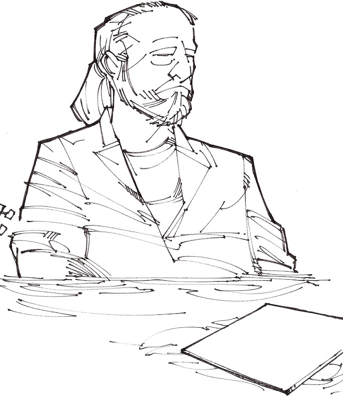
I'm
really proud of how this turned out. In my opinion, everything about the original layout was awful - the image, the placement of information, the typeface used for the title. The word "ghost" was done-up in a warped, "spooky" style; all the copy was relegated to the bottom right of the spread. The attempt to make the article spooky failed completely as the main image reflected nothing of the sort - Mic Fleetwood, waist-deep in water, playing a ukelele surrounded by fake loons. Apparently it was a nod to an original Fleetwood Mac album cover, but it was hardly ghostly. Not wanting to have to wade through mountains of stock images online, I decided it would be easier and more creative if I just came up with a new image myself, so I did! I liked Fleetwoods location -in a swamp- but I felt, to go with the ghost theme, it needed something more suggestive; I threw in some headstones and original Fleetwood records floating to the surface of what could be thought of as a flooded cemetery. Fleetwood himself, too, has something of a more ghostly appearance now, but it is a much more positive take on the supernatural theme. Not everything has to be evil or scary when it comes to ghosts.